
About the Artist

I’m often asked about what inspires me, and I never have a simple answer; My inspiration comes from an internal passion and appreciation for fine art. I see art as a medium of expression capable of transcending meaning for the viewer, maker, and the art itself. Through practicing art-making I feel a sense of evolution and catharsis.
The most characteristic aspect of my artwork is my signature technique which involves curing acrylic paint & using the dried finish; there are a variety of ways to do this. The most common method I use is painting designs onto a sheet of glass that I layer over each other until producing a solid sheet of paint I can then peel and transfer onto a canvas. I like to think I’m experimenting with painting as an art form while playing with the idea of decoration similar to Henry Matisse’s Large Decoration with Masks, where the significance is more about the aesthetic effect the art produces and its composition rather than how well it portrays an idea or certain intention. I still try to include some objectiveness in my art here and there, but my taste leans toward abstract expressionism.
It’s better to see my paintings up close and personal to get the full effect of the display. My effort towards the details intends to keep the viewer searching and thinking. Much of my inspiration for new artwork revolves around how I feel and whatever is around to inspire me in the moment, but I’m primarily driven by discovering new ways to make paintings and exploring new designs. Over time I’ve expanded my abilities and techniques and continue to learn and grow through my artwork. It serves me as a therapy I could not acquire elsewhere.
- KMART
About the Paintings
Below is a brief description of my paintings ordered from most recent to oldest. Scroll down for more!

“Day and Night”
Day and Night is an acrylic and spray paint landscape painting that illustrates the sky and mountains underneath during the day and night simultaneously. The most characteristic aspect of this painting is the array of variously-sized and colored stars dotting the forefront of the sky. the mountains in this painting were made as a print from “Celestial Mountains”, which was finished after Day and Night.

“School of Fish”
School of Fish is a rather large abstract expressionist painting with spray paint and acrylic that features a school of ten fish (plus one more!). See if you can spot them all. This piece is a continuation of a collection of paintings depicting minimally drawn fish against a deep blue backdrop with abstract fragments throughout.

“Goldfish”
Goldfish is another aquatic painting with a mixture of spray paint and acrylic paint. Although the subject of this painting is named, “Goldfish”, it is painted with silver and copper spray paint.
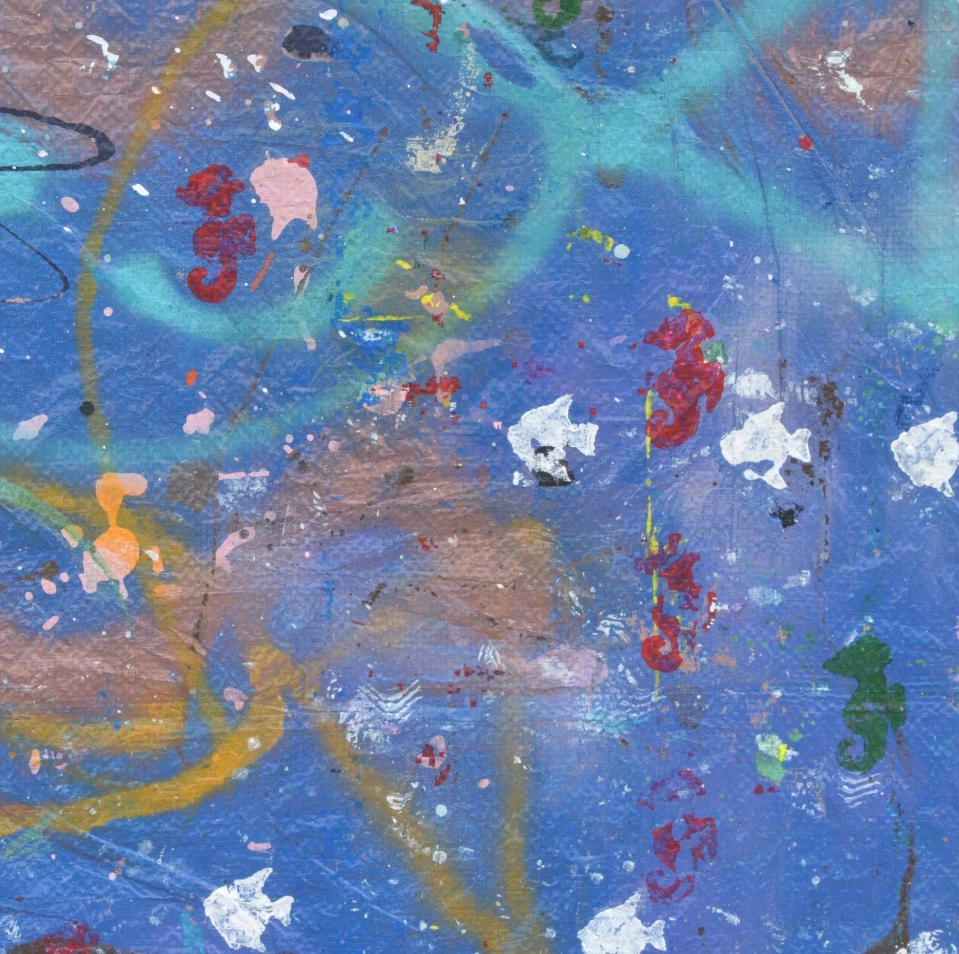
“Seahorse Babies”
Seahorse Babies is a whimsical painting in which I made great use of spray paint and stamps. The blue background and the larger fish are a product of my experimentation with spray paint against the polyethylene tarp I’ve used to create my paintings so many times before. There are many nuances to this painting, but the painting gets its name from the second red seahorse from the top of the painting, whose stomach and the area in its direction is surrounded by little red squares which represent miniscule infant seahorses being birthed into the aquatic ether.

“The Netherlands pt. 2”
The Netherlands pt. 2 is a multimedia acrylic painting with plastic ornaments, wax paper, spray paint, and marker on canvas. Through my trip to the Netherlands, I was lucky to encounter a lot of different works of art, but what resonated with my psyche the most was the country’s nature, which I attempted to reflect in this piece.

“Nightmare”
Nightmare is more of a conceptual piece in my opinion than it is meant to be an abstract expressionist piece with naturalistic details. This painting evokes a darker part of my subconscious with its dark color scheme and ominous figures. The tiger in the center of this painting was featured in another one of my paintings, “Jack’s Son Polluxz Dead”, but the first copy of this tiger was partially painted over after an error occurred in the final process of curing the figure into a full sheet of paint.

“The Netherlands pt. 1”
The Netherlands pt. 1 is a multimedia acrylic painting that includes spray paint, wax paper, stickers, miscellaneous plastic pieces, and metal ornaments. This painting is a visual representation of part of my experience traveling to The Netherlands, and all of the multimedia parts of this painting were collected from my trip! Pt. 1 represents the beginning of my trip which involved more urban settings and industrial backdrops.

“Starctopi”
Part 4 of a 4-painting series. Coming from the 8’ x 6’ polyethylene tarp transfer I intended to keep as one painting is an octopus controlling a starfish like a marionette. I used an icing technique to outline the starfish and octopus in acrylic. Next came a sporadic splash of metallic blue paint. I splashed some silver spray paint, rolled on some Sherwin-Williams honorable blue Latitude for the background, and sprinkled glitter layered with a spray fixative; the rest is your mystery. To me, this painting symbolizes the social context of control.

“Soothing Sky”
This painting is a leftover slab from the work done on Bleeding Hearts. it’s a smaller paint slab glued onto a 16” x 12” canvas. It shares the same design as Bleeding Hearts, but it became its own painting because I felt it had enough composition to stand on its own. The painting gives off a muted, ethereal aesthetic with hearts and soft minimalistic faces scattered throughout.

“New Graffiti”
This 10” x 10” painting comes as a glass panel encased in a wood frame. The painting was meant to be a paint slab added to a painting, but the acrylic paints used in its creation weren’t elastic enough to peel off. This painting and the Agares painting share the quality of having the painted side behind the surface it was painted on. In terms of the meaning behind this piece, It was a small effort to explore the aesthetics of modern handwriting without relying on evoking meaning through words.

“As Above So Below”
This painting consists of a combination of paint slabs that fall together into a rich, abstract landscape picture. The background is a layer of gold spray paint resting on a thick splash of purple Interior house paint. The painting pays homage to a horror movie with the same name. The black and gray circle in the center of the painting is an imprint of a paint-can lid.

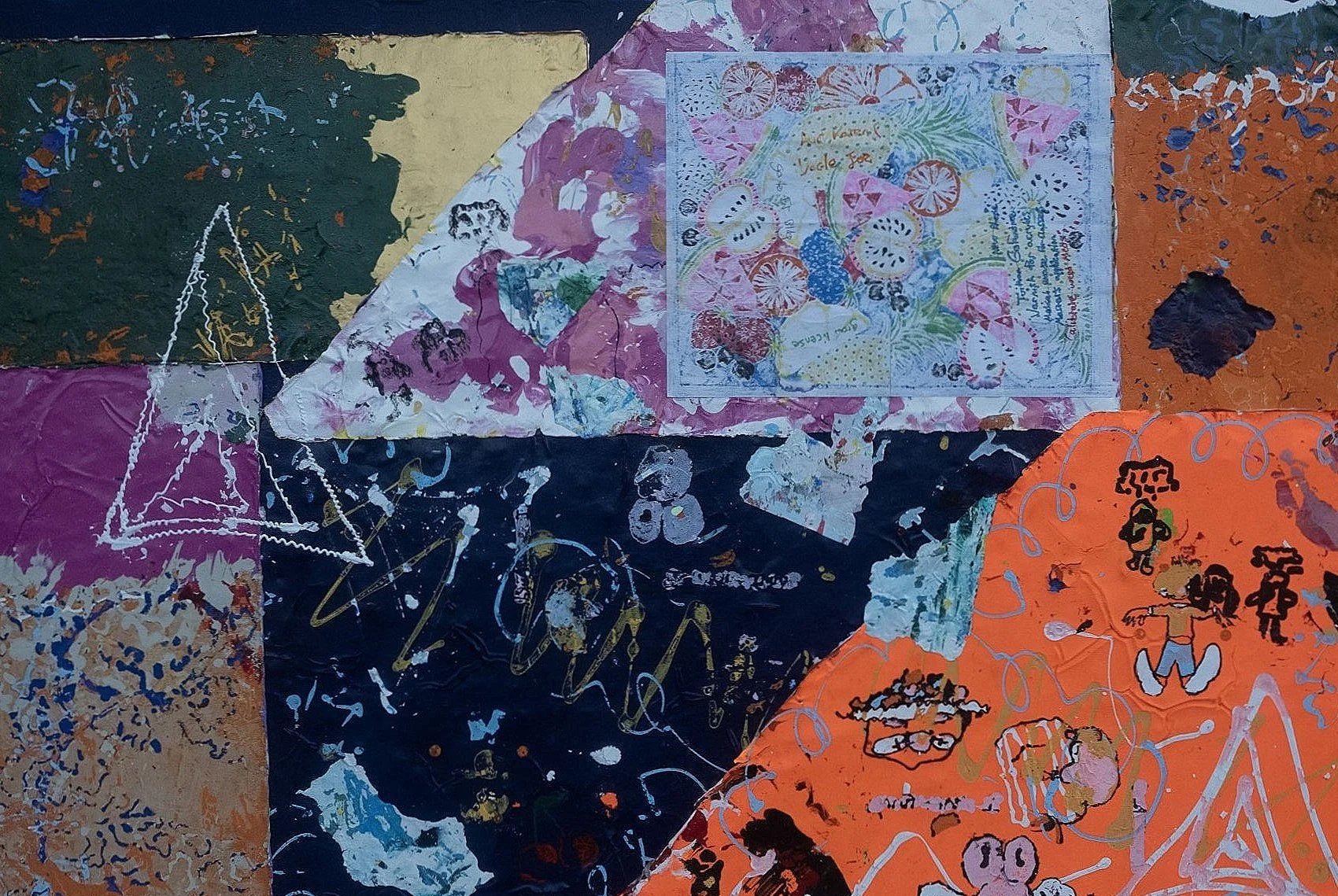
“Wild Trophy Horses”
This piece comes from another paint transfer I produced from my plastic table. I started by adding layers of paint onto a mostly bare canvas that was the plastic table. I previously had finished the background of “Agares” on this surface, so some black acrylic paint residuals were left to cover some area of the overall space. I experimented with sticking dried conglomerates of paint fragments from other paintings that had fused together while stored away in a plastic box. I knew that if they came through, there would be a crazy pop of various colors and designs, so I decided to continue that chaotic aesthetic into the rest of the piece with my signature style. I was feeling very motivated to accomplish this painting, which explains the triangles and trophies. I think they fit together to convey a sense of strength and grace among the calamity of the rest of the painting’s disarray. The result is a dichotomic clash between wilderness and order, a running theme in my art.

“Portal to Miami”
Part 3 of a 4-painting series. It was part of an 8’ x 6’ polyethylene tarp transfer I intended to keep as one painting. The areas in black paint were residuals from my work with “Agares”. I used an icing technique with plastic bags and acrylic paint to draw out the buildings and the outline of the palm tree leaves, and the stalks of the palm trees were applied with a red can of spray paint. Similar in theme to another painting in this series, “Wrinkle in Space”, it represents a portal that transitions the viewer to a new environment.

“Mangrove Minnows”
Part 2 of a 4-painting series, this piece is a whimsical addition to my previous aquatic-themed paintings. It was part of an 8’ x 6’ polyethylene tarp transfer I intended to keep as one painting. There are all kinds of different layers of paint here, but the minimalistic style might distract some from noticing. what may just look like little minnows drifting around is actually depicted by gallons of paint and various application techniques.

“Wrinkle in Space”
The name Wrinkle in Space is a reference to part of a video game (GBA FFTA) where a boy is sucked into an alternate universe by dark magic. The black area represents the world being swallowed up into another realm. The black space on this canvas is from paint I spilled while making the background of Agares on my polyethylene tarp. After peeling the paint off the tarp, I painted in the buildings’ white lines. This painting is part of a 4-painting series. My initial goal was to craft the largest painting I ever made. Well, that fell apart when the reality set in that I just don’t yet have the means to produce, store, and distribute an 8’ x 6’ painting. Yet. One day I will, though, so watch out.

“Agares”’
This painting was one of my most technically demanding pieces. The canvas for this painting is a plastic board one of my neighbors threw away. It had the ten commandments painted on it. I scraped them down to indiscernible letters to create some space on the canvas, starting by drafting the picture on paper. Once that was done (a year later) I traced the drawing in paint onto the plastic board. When the drawing was finally fully traced in paint, I covered the rest of the canvas in a thick layer of tricorn black house paint. The dried paint was supposed to peel off of the board and be glued onto a canvas, but it wouldn’t budge, so I kept the paint on the board and framed it that way, covering the remaining empty areas with metallic gold acrylic. This painting was my way of sealing away negativity in the way of an exorcist. Agares is responsible for leading lost souls into the underworld, so I sealed him behind holy scripture to prevent him from beckoning more souls who venture into the abyss.
“One World”
I did most of the work for this painting shortly before having a psychotic episode that landed me in a mental institution for two weeks. This piece is a reflection of my fractured mental state at the time. On this painting, there’s a sheet of paper with a page from a coloring book that I filled in while trapped inside. It’s hard to explain unless you’ve been admitted to a mental facility, but they’re not really that helpful or therapeutic. I could go on, but to save you the turmoil, just look at my scrambled brain on a canvas.

“The Hills Have Eyes and The Wind Has Lips”
If 2020 was a wrecking ball, 2021 was the eye of the storm and 2022 was the storm’s outer bands whipping back around to finish me. The Russia-Ukraine war began out of nowhere about a month after I was in Moscow visiting friends and family. It got a little too intense when I started seeing Apple News articles warning about Putin nuking the US. Things didn’t improve when my boss had a heart attack at work and within the same week two children drowned to death in the lake right next to my dorm. I was also trying to finish the last classes of my college career while working 50 hours a week at a new job. I mustered up enough time and energy to slather some paint onto a folding table. That was all before I had a psychotic episode and ended up in a mental facility for two weeks. For a moment I lost touch with reality. After all that, it took me the rest of the year to get back to a sense of normalcy, graduate college, and finish this piece.

“Stuck at Sea”
I made the background of this painting in 2020, but I reached a roadblock and cast it aside. In fact, even when I picked it back up almost two years later, I still had no direction for it. The tiny, sporadic red squares I filled in with a toothpick are evidence of my aimlessness. At some point, being an artist in Florida, you’re going to end up painting a fish. It’s a cliche that I tried to avoid for a long time, but entropy won. A grouper, a stone crab, and a Florida lobster are all here painted traditionally, but that’s not what the painting is about. Summer of 2022, I moved out of student housing for good and was looking at graduating college (or so I thought). The past couple of years felt as though I was lost in a giant fishbowl, and I didn’t yet know what was in store for me. The failure that ensued in my life had me thinking I was going to be stuck like a castaway. Making this painting was a way for me to get through my feelings of uncertainty and futility.

“Jack’s Son Polluxz Dead”
Here and there I’m told that my art resembles Jackson Pollock’s, and it doesn’t sit well. Most wouldn’t realize but saying that someone’s art looks similar to a famous artist’s is an insult to that person’s originality. Yes, some parts of my art are abstract expressionist, but Pollock’s work and mine are not similar. I paint backwards and display the underside. He was just lucky his drunk mess spilled onto a canvas. With this painting, I wanted to display a combination of my art styles. I painted the blue cow in the close-up traditionally, but I used my finger and a toothpick instead of a brush. The result is a contemporary impressionist figure with an abstract background. Jackson Pollock never did that (to my knowledge). In the center of this painting is a scene of a car crash, because it was Pollock’s cause of death. I painted it loosely and freely on a blue polyethylene tarp and transferred it to the canvas. Admittedly, my claim to fame is an abstract application method (like Pollock), and I’m a rebel too. So, I guess I should just accept the notion he and I bare some similarities. I just hope we don’t end up the same way.

“VAPEWORLD”
In 2019, over the course of a semester and a half (what would’ve been a full school year was cut short by COVID-19) my roommates and I made it a custom to discard our used vapes by throwing them into a pile under my bed. In that time, we managed to collect about a hundred disposable vapes that I held onto. In 2021, I had an opportunity to use them for good. I soaked each vape into a puddle of modeling paste on a canvas and painted the canvas black. Then, to be cute, I whipped up a couple of cartoon vape cartridges, traced some transfers of them on a sheet of glass, and glued them onto the canvas. Vape World isn’t a fictional place, It’s every college campus in America after the year 2016. Or, at least that’s what it looks like from the inside of a 20-something-year-old’s brain.

“Warped Heart”
I made this painting for a final project in a summer “art appreciation” course. The objective was to isolate a principle of art, but I wasn’t trying to follow the rules (my principle was Emphasis). I made this piece by applying a lot of gesso and modeling paste to a Masonite board and then painting over it. When I stood in the front of the class for critique, my professor explained that the Masonite wouldn’t hold up with all the gesso and paste. He said the painting would warp over time if I didn’t frame it. A couple of years later and still no frame, but you can choose your own if you want to purchase this piece! One could draw a poetic analogy about health or self-care, but right now I’m too focused on the paint.

“Squidanenemy ”
A fun, quick painting that took me only a couple of months, featuring four sheets of acrylic paint. the painting depicts a squid approaching a reef of little fish. The blue outer border with black lines is made of two sheets of paint I cut up and layered around the edges to simulate a background. on the left side is a 21&1/2” x 13&1/2” square of paint that started as an attempt to teach my friend how to use my technique. Well, it didn’t work out, so I used the panel for a whimsical doodle of fish. The square from the right of the painting was made of excess paint in my inventory. It just so happened that the pieces all flowed together. the only part I had to contrive was the eye of the red squid seen floating right to left; the rest of the painting happened pretty naturally. It’s an elevated take on abstract expressionism paired with my innovative crafting techniques.

“Agares Paper”
Another piece from my last real year of college; this one was a draft for a painting. It was drawn in pencil on two sheets of Dick Blick Newsprint that I taped together when I ran out of space at the bottom of one. I made the drawing by using a visual reference from my phone of ‘Agares from Collin de Plancy’s Dictionnaire Infernal’. The plan, as with many of my subjects, was to draw a draft of the painted version that I could trace in paint over a glass panel and transfer onto a canvas. It took a while, but the results paid off, and I decided to publish the draft as its own piece because quite frankly, it looks good. Most of my works have some kind of flaw, but this one just has a paper problem.

“Thinking Too Hard”
Starting in 2021, I made this over the course of my last real year in college. It was a hectic time. While working on this piece, I was running an art club I founded, interning for a biotech company, and developing my pitch for a cryptocurrency LLC I created. All of that came with a mix of emotions that influenced the art I was making. This piece has a lot of little details. There are 4 abstract expressionist glass panel paint sheets that make up the background. There’s also a centerpiece slab made of a mix of acrylic paint and Elmer’s glue that depicts a white Dodo bird. 4 more Dodos, a handful of stars, a T-rex made of words under an active volcano, and 4 new Bares are just some of the items that make an appearance in this piece. Like I said, at the time I had a lot going on.

“Coffee”
The centerpiece of this painting was the result of my use of a roughly 19” x 16” sheet of plastic as an easel and a landing pad for excess paint. The same sheet of paint on this piece was the origin of the tree in the bottom right area of my Akrotiri mosaic. in the middle of Coffee’s centerpiece, there’s a jagged vertical line that separates a white (left) and blue (right) area that occurred due to the removal of the tree for Akrotiri on Thera (Santorini). This piece is energetic and stimulating like a cup of coffee, hence the name. Also, the name is a reference to my high school art teacher who inspired me to be a full-fledged artist.

“Floating Sheep”
This painting was one of the sheets from the glass panels that didn’t make it onto The Bares. It gets its name from a small sticker of a sheep seeming to float above the background’s chaotic atmosphere.

“Ocean Space”
One of my signature glass panels was in need of cleaning and I smeared some blue acrylic over it. A happy accident, I dropped the wet panel and it landed on my tarp face down. When I picked it up, the blue paint had a swirly texture to it and was less thick in some areas than others. I had to apply another layer of paint to the glass in order to peel it properly, and I chose white, which brought out the contrast in value between the dark and light blue areas. The deepness of the blue reminds me of the ocean and outer space at the same time.

“Blue Matrix”
After I made Sailboats, my blue tarp reentered my inventory as a floor cover to protect my dorm room/art studio from requiring a cleaning service. The residual mess turned out to look quite captivating, so I slathered some blue acrylic paint over a large area and peeled the tarp clean once the blue paint cured. Blue Matrix is about stepping into another world where you’re stripped down to your spirit as you float through the blueness. One notable aspect of this piece is the phthalo blue square in the top right corner which is an imprint of the painting I published after this one.

“The Bares”
This painting continues my trend of collages while also premiering one of my signature designs, a 21&1/2” x 13&1/2” square sheet of paint (give or take). I started pumping out a bunch of these, but something was missing; they weren’t completely encapsulating the essence I was trying to attain. Somehow, somewhere, I ended up with themed teddy bears to go with each square’s aesthetic. the teddy bears were drawn from visual references and then traced in paint over a sheet of glass. Once they dried, I peeled them off and transferred each one onto a sheet of paint. Welcome home. I called them The Bares because of the raw expressivity they hold, and without them, the painting would seem kind of naked.

“Sailboats”
My last painting of 2020 came in late November and was peeled from a blue polyethylene tarp. Regrettably, it’s very Pollock-esque, but the difference is he never peeled the paint off the ground and flipped it over to see the underside. that’s part of what I’m counting on to set myself apart as a painter. people haven’t yet realized that paint becomes a different material when it dries, specifically by how part of it evaporates. I believe the lower half of a sample of paint evaporates less as it cures, so its solution is more condensed, and it has a higher-quality appearance because it tarnishes less by drying. Paint mimics whatever it adheres to. I mainly paint on glass and some types of plastic. Since I dry my paint on a surface it can’t bind to, I can peel the paint off and display the other side. This means I have to paint backwards or bottom-up and create thick layers of paint so I can peel it and turn it over. It’s a technique I discovered on my own around late 2018.
“Akrotiri on Thera (Santorini)”
This painting is a mosaic of dried acrylic paint. It depicts the Island of Santorini around 1600 BC when it was called Thera. Around that time, a major volcanic eruption occurred on the island that altered world history as we know it. Coming off a clean slate from a five-painting series, with a lack of material and inspiration, I resorted to a box of paint scraps and organized them by color in a matter of days. what took me a year was realizing the bigger picture and putting the pieces together.

“Mr. Ious”
The next three paintings: Mr. Ious, Ugly Corner, and Harmonic Chaos, were all paintings I made out of the leftover pieces that didn’t make it into Oh Brother or Sister Sister. All the pieces on Mr. Ious were made on a glass panel. It has a mainly abstract expressionist border, but includes a portrait of a businessman with puzzle pieces in his head and eye. The puzzle piece in his eye is actually a full puzzle piece that got painted over and stuck in the painting. My signature flows across the center of the artwork. Also, a frog hopped up on the painting and died there under the right corner of the figure’s suit.

“Ugly Corner”
Ugly Corner contains works that could’ve made it onto Sister Sister, but didn’t quite fit. It features a thuggish cartoon bunny surrounded by geometric abstract-expressionist-styled sheets of acrylic paint to portray a blocky sense of space in a funky place and time.

“Harmonic Chaos”
This painting is a purely abstract- expressionist collage made of leftovers from Oh Brother and Sister Sister. The forefront of the piece exhibits a sheet of acrylic paint I formed on a plastic circular easel. One of the same kind can be found on both Oh Brother and Sister Sister.

“Oh Brother”
If you’re wondering what I was doing during the 2020 Coronavirus pandemic, I spent a lot of time making these next two paintings. “Oh Brother” and “Sister Sister” are literally brother and sister collage paintings constructed alongside each other containing matching pieces of artwork. OB has a darker theme whereas SS is a more lighthearted piece. Some of the items on OB are; a worm with wings, some smashed pumpkins, 2 pistols, the grim reaper, a centipede, Joaquin Phoenix as the Joker, and more. Most of the objects in the painting were transferred from a glass panel or painted on saran wrap except for the portrait of my dog, Jack, which was too thin to peel off and still has glass attached to it

“Sister Sister”
I started off this painting by pouring out about a full gallon of paint onto a canvas. I dipped a couple of cloth rags into the paint, but it was so thick it swallowed up the rags and they’re still on the canvas. Afterwards I drew flowers, animals, racecars, playing card royalty, and cartoon fruit, among other playful things (and people) onto a sheet of glass, dried, peeled, and pasted onto the canvas. “Oh Brother” was made in the same way at the same time.

“Tegernsee”
This one was an interpretation of a picture I took standing in Tegernsee, Germany, although it depicts a plot of land across the lake at Rottach. I had a brief phase where I dabbled in charcoal art, but this is the only charcoal piece I’ve entered into my portfolio so far. It took me a solid week over Thanksgiving break to start and finish this picture.

“Down a Road”
This painting is an interpretation of a photo I took while riding a ferry on the Thames River in London. Most of the work on this piece was painted directly on the painting, but there were some aspects, like the brown buildings with maroon and blue windows and the second figure from the right, that I painted on wax paper and pasted onto the canvas. There are other areas where I glued down colorful shards of paint made on a slab of glass.

“Dissipate”
This painting is a depiction of matter dissolving into nothing. It’s oriented upside down to reflect the feeling of destruction. The blue side and the black side of this piece are two separate works that I constructed with acrylic paint on a large panel of glass. On the colorful side of the painting, there are strips of the same pattern layered over the base sheet. white acrylic paint mixing with blue created an effect called blooming that I incorporated in future paintings.

“Uncovered Undiscovered”
This painting was originally going to be a portrait of a few famous comedians’ floating heads in outer space, But I pivoted sharply one night in college when I got tipsy and pulled an all-nighter. The galactical background was made with chalk shavings I covered in spray fixative, and the top right corner showcases a silhouette I made by putting silver paint on my face and pressing it against the canvas. There’s also an abstract portrait I made unintentionally in the center of the piece which features a floating third eye from the remnants of the comedians painted underneath.

“Chaos”
I constructed this painting in a unique manner. The background came first, but I started making it by dripping paint onto the floor of my apartment bedroom (middle left, right). That transpired into a sheet of paint dripped and dried on wax paper. The body was inspired by Hajime Sorayama’s Dior Robot that I used as a visual reference. I drew the body directly on the canvas in pencil and then traced over it in white paint on a sheet of wax paper. I peeled the paint off the wax paper and glued it to the canvas and the rest is history. There’s also a pile of scraps from this piece that I glued into a stack in the bottom-right corner.

“The Owl”
One of my smallest paintings; “The Owl” started as a drawing in a sketchbook that I painted over while at the beach. eventually, I cut out the owl drawing and pasted it onto a 14” x 11” canvas that was previously used as an easel for “The Owner”.

“The Owner”
The largest painting I’ve made (as of 2023), is a combination of traditional portraits of my dog; Jack Daniels, and a picture of a cowboy from an old Western film. I drew the portraits in pencil and then taped them off to create the background of the painting using a paint-pouring technique. This painting is mostly made in a traditional style, but I glued a strip of red acrylic paint across the cowboy’s eyes. The red line represents the cowboy’s blindness to his connection to art and creativity symbolized by the red, blue, and yellow primary color scheme.

“Aphy”
This painting includes a portrait of an old pet of mine named Aphrodite. She accidentally walked into some paint and ran across the canvas as I was setting up, and it gave me the idea to use her pawprint as a design. This is a traditional style black and white acrylic painting of a few different cats. The portraits I painted with a fine brush.
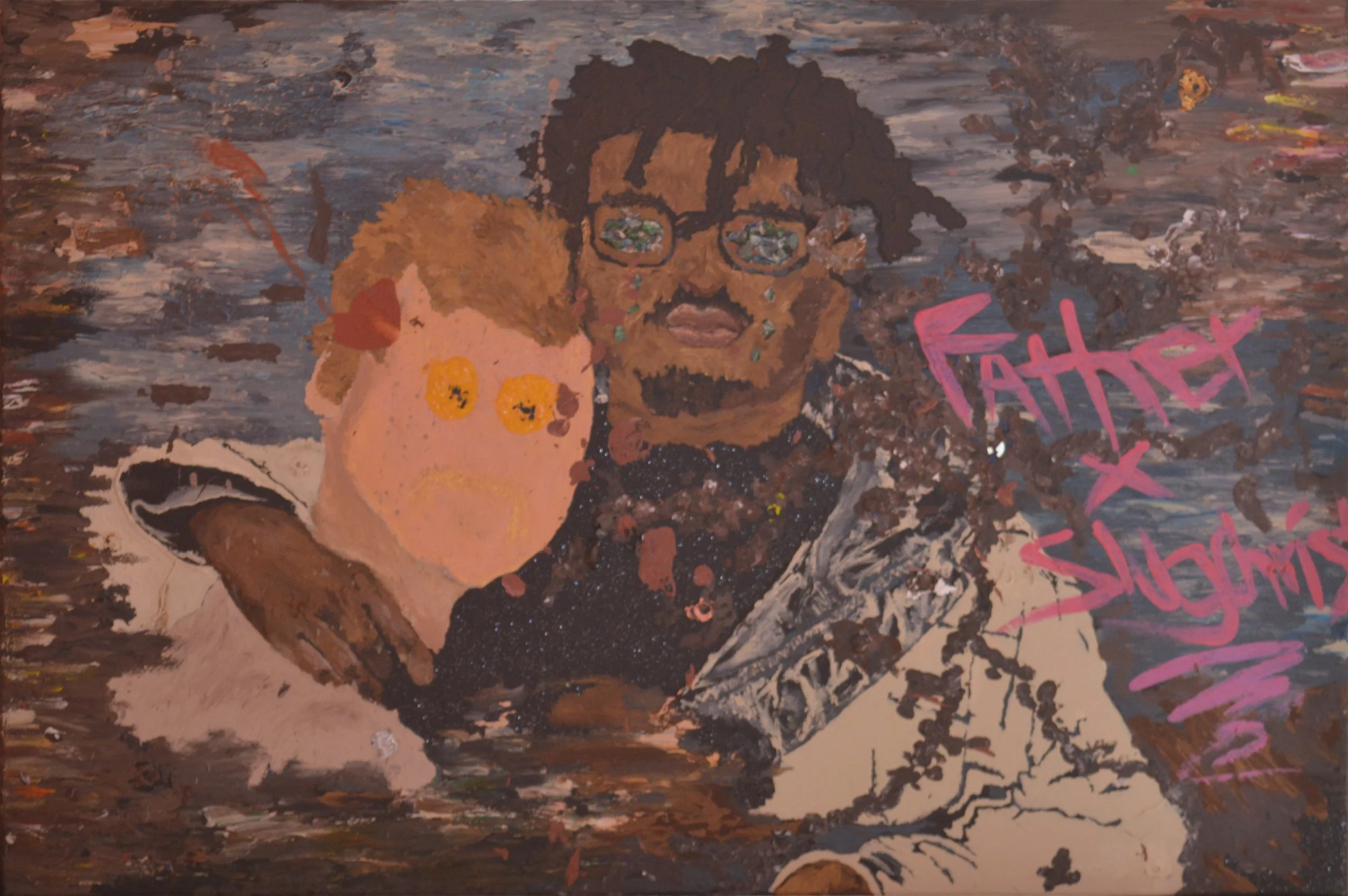
“Father x Slughcrist”
Although I’ve been painting since childhood, “Father x Slugchrist” is the first painting that got into my portfolio. It depicts two Atlanta-based rappers that were in the index of hip-hop artists I followed when I was in high-school. I painted mostly every part of this painting by hand. Most notably, Father’s (center right) eyes are constructed of white, green, and blue paint chips I cut up from a little circle I mixed and dried. Making Father’s eyes was my discovery of the signature technique I claim.